Wednesday, February 19, 2014

Hwk 2/19: Value!!

Hwk 2/19: Value!!

You need to have started your 10 Experimental Drawings by this point! They are small, so be thoughtful and creative in approaching them! You can use ANY MEDIA and approach. Think outside the box. I expect QUALITY pieces with insightful reflections.

Bring in ONE 3-hour drawing (can be longer, but does not need to be) from life focused on VALUE. 

Media and style OPEN, can use color or alternative tools, as well as collage or digitally drawn (but NOT digitally generated). MUST be gallery quality image (NO NEWSPRINT or FOAMCORE). Write one page on tools, approach, narrative, intent (if applicable). Print this out and bring it in. 

You must think about COMPOSITIONAL frame and the edges of your paper--You MAY use a border (but do not have to), but need to fill at least the majority of your 18"x24" paper and address value for ALL of this space (foreground, middle-ground, background): 

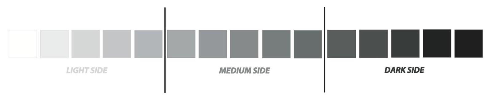
Where are things dark? HOW dark? How big are these areas? Where are things light? How light? Etc? Remember your backgrounding elements! It is the comparison of light to dark that give you both mass (in objects) and depth (in frame). 


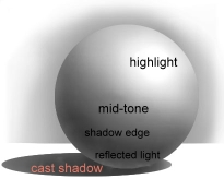
Some helpful vocabulary:

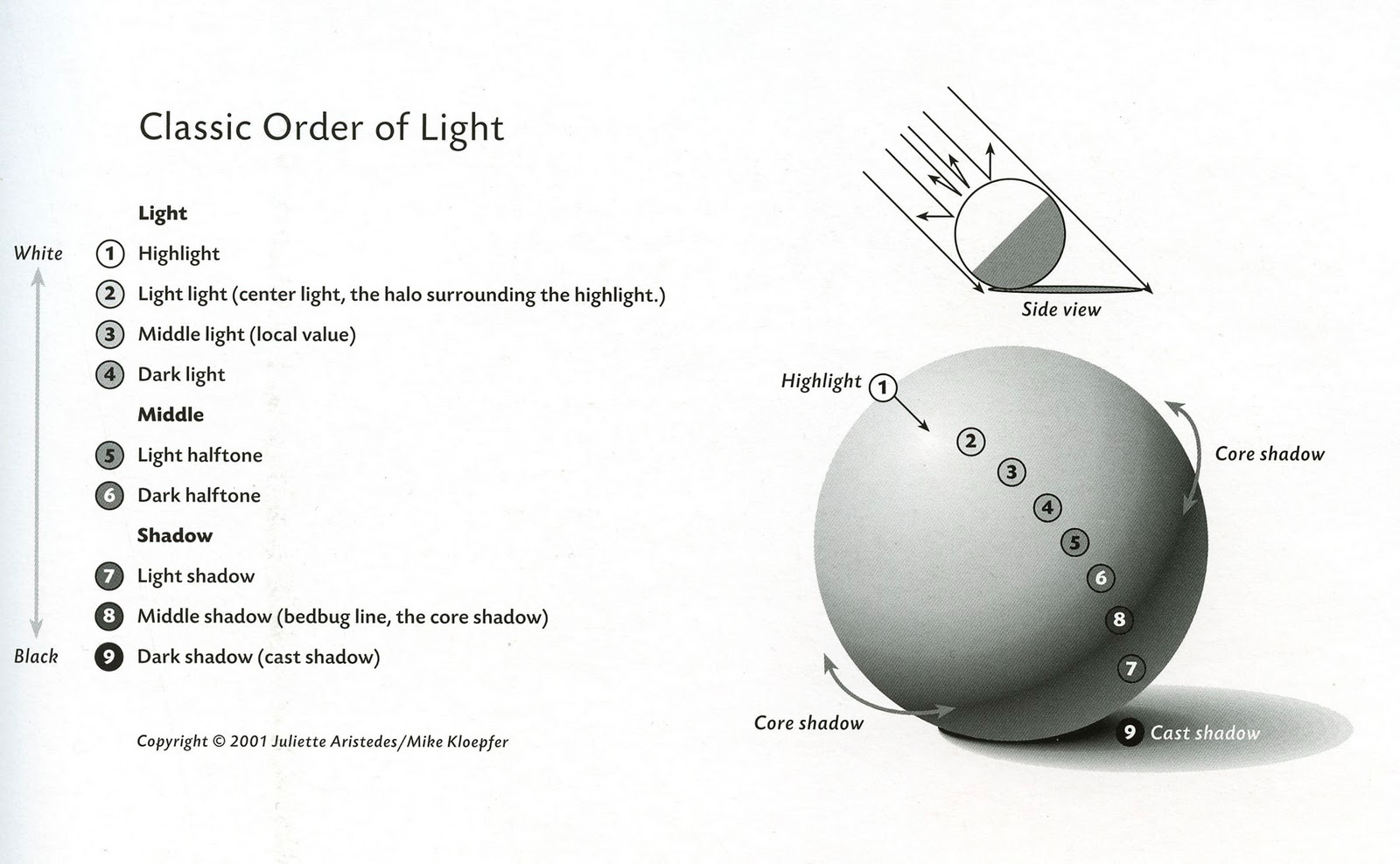
The Cast Shadow- This is the darkest dark. It is the shadow that is cast by an object on a surface that it is laying on. The cast shadow is the darkest where the object and surface touch, and will get lighter as it gets farther away from the object.


Shadow Edge- This value is on the opposite side of the light source. It is not the edge of the object.


Mid-Tone- This is what the actual color of the object is, without any effects from light or shadow.


Reflected Light- This is the light that is seen around an object, usually between the cast shadow and the shadow edge. It's the light that is bouncing off of the surfaces around the object. This value is never bright white.


Highlight/ Full Light- This is where the light source hits the object at full strength. It is usually shown by the white of the paper. All the areas of gray around the full light should be blended so that there is a smooth, gradual transition between them.

Monday, February 17, 2014

Cool Stuff and other notable art

http://www.worthytoshare.com/first-4-photos-just-kinda-neat-saw-5th-one-put-jaw-floor#

Very interesting series I thought you guys might enjoy.

Hwk: 2/17 GESTURE & MARK-MAKING

Hwk: 2/17 GESTURE & MARK-MAKING

Look back through the MARK-MAKING and INTERNET RESEARCH PROJECT posts and think about TOOLS, MARK-MAKING, & NARRATIVE. Create FIVE 5-10 minute drawings from life (do not all have to be figurative) with various tools and mark-making techniques. OPEN tools, media, ground. Can be longer than 10 minutes or larger than your sketch-book, but do not have to be. Think OUTSIDE the box! What mark-making can be used to create believable figures in space? What story is being told?

For each image think about:

~WHAT is being said? Is this the only storyline you can read in this composition?
~HOW this is being said (tools/ marks/ color/ etc)
~Foreground/ background relationship
~At least three adjectives you could use to describe these marks

You do not need to write this down, but we WILL be discussing these in class next time.

BRING GLUE or a GLUE STICK for Wednesday's class!


 Alternative mark-making sketches:


And some collages for President's Day (these are valid too!):


Internet Research Project JEFFREY


ARTIST WHO I LIKE

Eric White

Carrie Ann Baade

Shahla Rosa

Vladmir Kush

Martin Kippenberger

Lucian Freud

Jeff Koons

Chuck Close

Ida Applebroog

Banksy


WHO I DISAGREE WITH

Ronald Davis

Yayoi Kusama

Anselm Kiefer

Dan Christensen

Lynda Benglis

Jack Bush

Robert Goodnough

Arshile Gorky

Jean Michel Basquiat

Andy Warhol


Vladmir Kush
Vladimir Kush was born in Russia, in a one-story wooden house near the Moscow forest-park Sokolniki.
At the age of seven Vladimir began to attend art school until late evening where he became acquainted with the works of great artists of the Renaissance, famous Impressionists, and Modern Artists.
Vladimir entered the Moscow Higher Art and Craft School at age 17, but a year later he was conscripted. After six months of military training the unit commander thought it more appropriate to employ him exclusively for peaceful purposes, namely, painting propagandistic posters.
After military service and graduating the Institute of Fine Arts, Vladimir painted portraits on Arbat Street to support his family during the hard times in Russia.
In the year 1987, Vladimir began to take part in exhibitions organized by the Union of Artists. At a show in Coburg, Germany in 1990, nearly all his displayed paintings sold and after closing the exhibition, he flew to Los Angeles where 20 of his works were exhibited and began his “American Odyssey.”
In Los Angeles, Kush worked in a small, rented home garage, but was unable to find a place to display his paintings. He earned money by drawing portraits on the Santa Monica pier and eventually was able to purchase a ticket to his “Promised Land,” Hawaii.


Kush’s work appealed to me immediately and I admire his surrealist approach that has strong influence from the master, Salvador Dali. I love surreal art and his has something to offer that I really appreciate. The lines from the real and the un-real are danced along in a way that creates something beautiful and disturbing all at once.  As I went through his images I struggled to find one I didn’t like or didn’t find some kind of a connection to. 

Lucian Freud

'I've always wanted to create drama in my pictures, which is why I paint people. It's people who have brought drama to pictures from the beginning. The simplest human gestures tell stories.'
-Lucian Freud


The way in which Freud paints his figure is something that feels raw and real. I love how when they are first viewed, for me, I see extreme detail. When the picture is viewed up close you are rewarded with the thick brush stroke and the painted quality of his art.  The detail in the images I chose to post show his intense attention to detail in the wrinkles of the face


Yayoi Kusama

I put Kusama on the dislike list because I am the type of person who likes hyper realized to surrealist art. I found it hard for me to place her in any list. I don’t necessarily understand how she could use dots that much, when I begin to realize that she knows exactly what she is doing. The art she creates is different from my taste, but nonetheless it is good art. Also she claims to get her inspiration from a childhood hallucinogenic experience, and that’s pretty cool.